There are colors that enter a room before the person does.
Bright red. Electric blue. A yellow so sharp it seems to speak in capital letters. These colors are beautiful in their own way. They announce themselves. They know how to be seen.
But kimono often taught me another kind of color.
A color that waits.
A color that does not ask to be understood immediately.
A color that changes depending on the hour, the weather, the room, the obi beside it, the skin beneath it, the season we imagine while wearing it. In Japanese dress, color is rarely just color. It is atmosphere. It is memory. It is a small conversation between cloth, body, light, and time.
This is perhaps why I am drawn to colors that speak softly.
Not silent colors. Soft colors.
There is a difference.
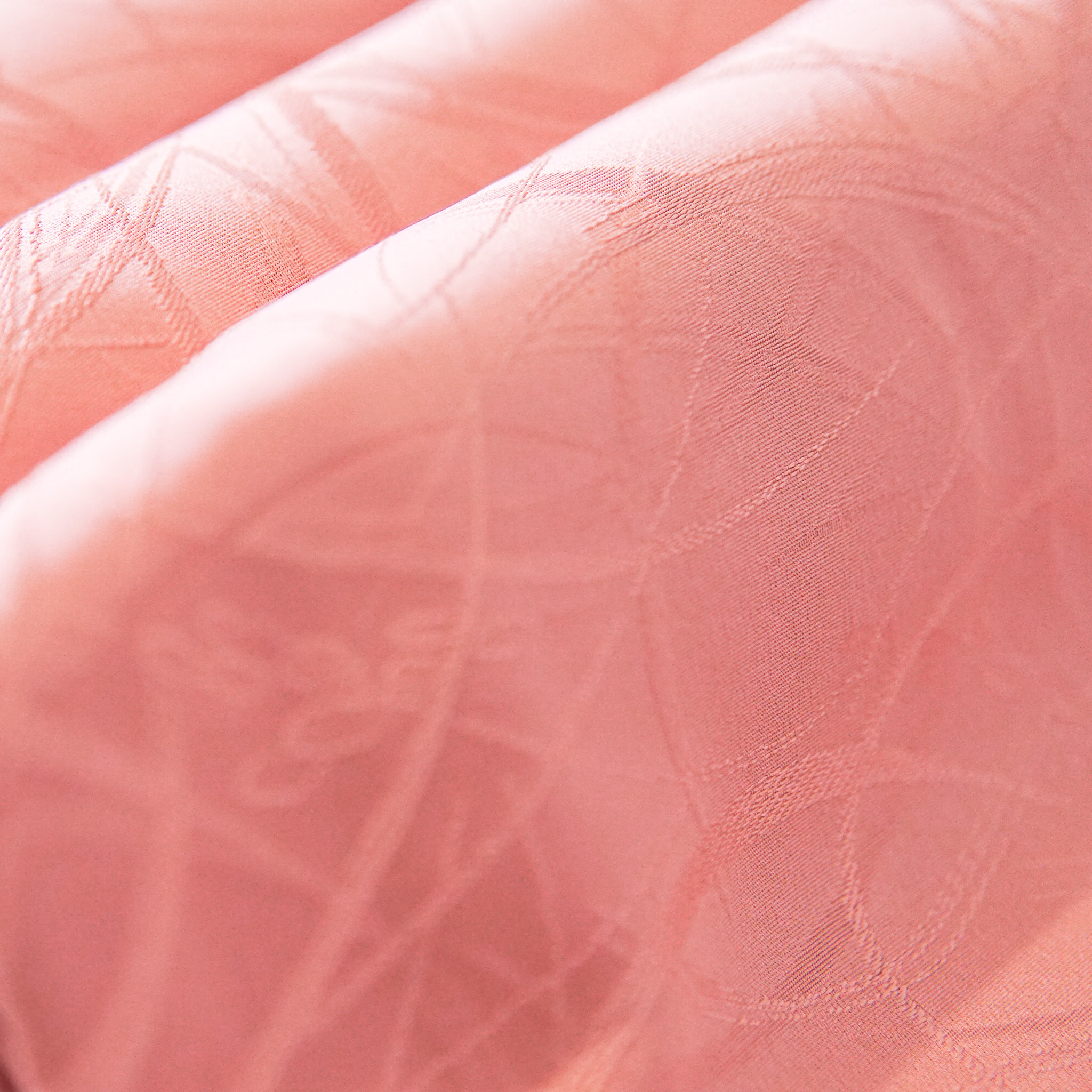
A silent color disappears. A soft color remains, but it does not insist. It invites the eye to come closer. It asks for patience. It may look like grey at first, until you notice the plum inside it. It may look like brown, until you realize it carries the warmth of fallen leaves. It may seem plain in a photograph, then suddenly become alive when folded, layered, or worn in motion.
Japanese traditional color names often carry this kind of intimacy. Many are not named after abstract ideas, but after things observed closely: young grass, withered leaves, smoke, ash, plum blossoms, willow, indigo, persimmon, tea, mouse-grey, the underside of a petal, the quiet blue before rain. The name itself becomes a way of seeing. It does not simply say “pink.” It asks: what kind of pink? Sakura? Faded plum? The faint blush of a bird’s wing? [1]
To name a color so precisely is to admit that the world is not made of basic categories. It is made of transitions.
Between winter and spring. Between new leaf and mature green. Between flower and fruit. Between brightness and shadow. Between what we see and what we remember.
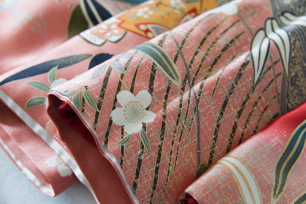
In Heian court dress, the idea of layered color was developed into an art of astonishing sensitivity. The term kasane no irome can refer not only to the colors created by layering garments, but also to color combinations between outer and inner fabric, and even woven effects created through warp and weft. In other words, color was not always treated as a flat surface. It was something produced through depth. [2]
One example often mentioned is hanatachibana no kasane, a layered color combination associated with the tachibana orange. Its colors suggest time passing: pale green leaves becoming deeper, white blossoms appearing, then orange fruit forming. A garment could hold not just a color, but a sequence. Not only a season, but a season becoming another. [3]
This way of thinking feels very different from choosing a color because it “matches.”
It is closer to choosing a mood. Or a memory. Or a moment in nature that will not last.
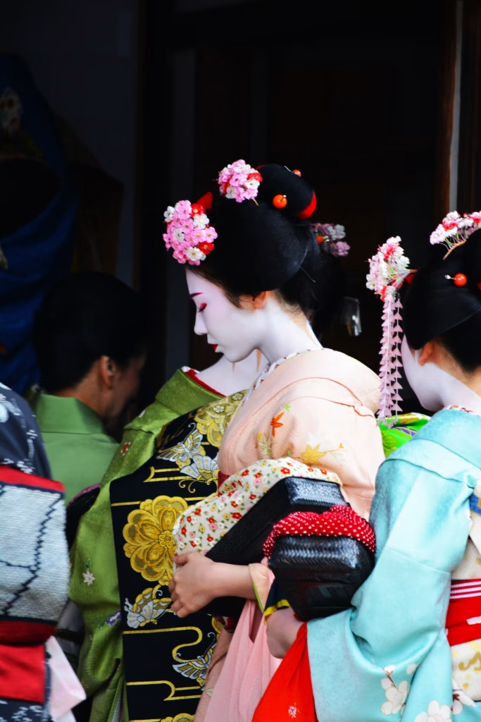
And maybe that is why kimono can feel so difficult to explain outside Japan. When someone asks, “What color is it?” we may answer, “light olive,” “dusty blue,” “muted pink,” because these are the words available. But the feeling is often somewhere else. A kimono may not be beautiful because the color is flattering in a modern styling sense. It may be beautiful because it carries restraint. Because it lets the obi speak. Because it looks quiet indoors and luminous in daylight. Because the color seems to belong to a season that has almost passed.
Outside Japan, these soft colors become even more interesting.
In Germany, where I live, the light is different. The streets are different. The rooms are different. A kimono that might feel modest in Kyoto can look unexpectedly poetic against European stone, old wooden doors, winter windows, tram stops, or the grey-blue light of an overcast afternoon. Sometimes the distance from Japan makes the color louder. Not louder in brightness, but louder in meaning.
A muted kimono worn abroad does not blend into its original landscape anymore. It has to create its own.
This is where I feel Tsujigahana begins.
Not as a place to explain Japan perfectly. Not as a place to turn kimono into costume, trend, or exotic decoration. But as a quiet editorial space for looking closely. At fabric. At color. At the way Japanese culture travels. At what changes when a tradition is carried into another climate, another language, another life.
Soft colors are a good place to start because they teach us how to look.
They resist quick consumption. They do not always photograph easily. They are not made for the scrolling eye. They belong to the world of slight differences: one grey warmer than another, one brown leaning toward tea, one purple almost hidden inside smoke. During the Edo period, the phrase shijūhatcha hyakunezumi — “forty-eight browns and one hundred greys” — came to describe the abundance of subtle brown and grey tones in fashion culture. The numbers did not literally mean only forty-eight and one hundred. They meant many. Many browns. Many greys. Many ways to remain understated and still be different. [4]
There is something deeply modern in that.
Today, we are often told to be visible. Build a brand. Stand out. Make content. Use stronger colors. Say it faster. Say it louder.
But kimono, especially in its quieter colors, reminds me that presence does not always need volume.
A person can be memorable in soft grey.
A room can be changed by a single muted obi.
A pale color can hold more emotion than a vivid one, precisely because it leaves space for the viewer.
Perhaps this is why I love the colors that are difficult to translate. They make room for uncertainty. They allow us to say, “I do not know exactly what this color is, but I know how it feels.”
And maybe that is enough.
A soft color does not explain everything. It offers a beginning.
It asks us to slow down, to look again, to let our eyes adjust. It reminds us that culture is not only preserved through grand ceremonies or perfect knowledge, but also through small acts of attention: folding a kimono carefully, choosing an obi for the weather, noticing the green inside grey, or finding a Japanese color alive under European light.
Tsujigahana begins here, with this kind of looking.
With colors that do not shout.
With colors that stay.
Sources Consulted
- DIC Graphics, “日本の伝統色 -四季編-”
- 伝統色のいろは, “日本の色 / Traditional Colors of Japan”
- 有職の「かさね色目」
- 日本服飾史 / 風俗博物館, “源氏物語の女房装束”
- 国立国会図書館 レファレンス協同データベース, “四十八茶百鼠”
- みてぐら, “四十八茶百鼠”

Leave a Reply